a character brand,built from zero.
no existing logo, no guidelines, no reference account. NI-HIGH started as a sketch of a lucky cat and became a full world: twelve marks, five animations, a type system in two languages, and a character consistent from clay sculpt to final render.
see the build →made for ni high.
the world, in fourteen seconds
character, type, and palette in one continuous pass. this is the piece everything below exists to feed.
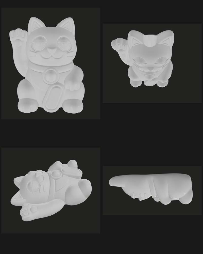
clay before color
the cat resolved in neutral clay renders first. silhouette, proportion, pose. color and material only after the form held up bare.
the sticker mark
the character compressed to a badge: outlined, coin in paw, readable at sticker size. one of twelve marks in the set.
the thirteen second ad
faster cut of the same world, built as a paid placement. same assets, different pacing. one build feeding two jobs.
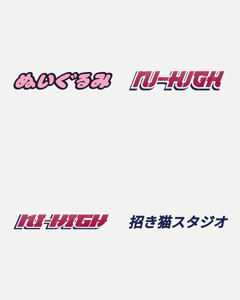
a wordmark in two languages
Latin and Japanese lockups drawn as one system. ぬいぐるみ and NI-HIGH holding the same weight and slant.
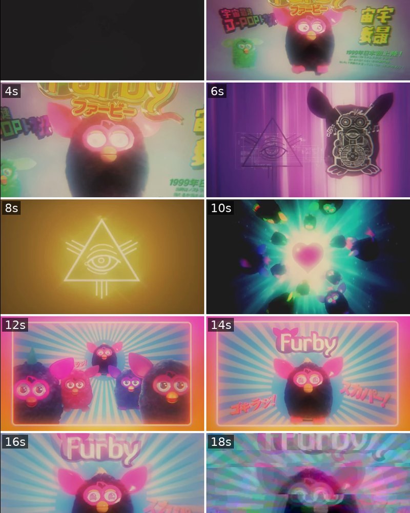
the storyboards
every animation boarded before render time was spent. the boards are why five animations came out of one production window.
the three second burst
a loopable sting for transitions and stories. short enough to repeat without wearing out.
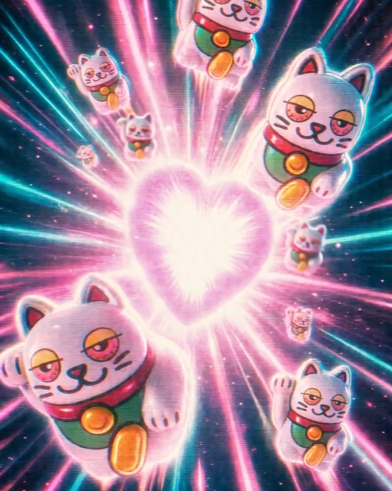
the heart burst
the character multiplied into a crowd scene for poster and cover use. the world scales past a single mascot.
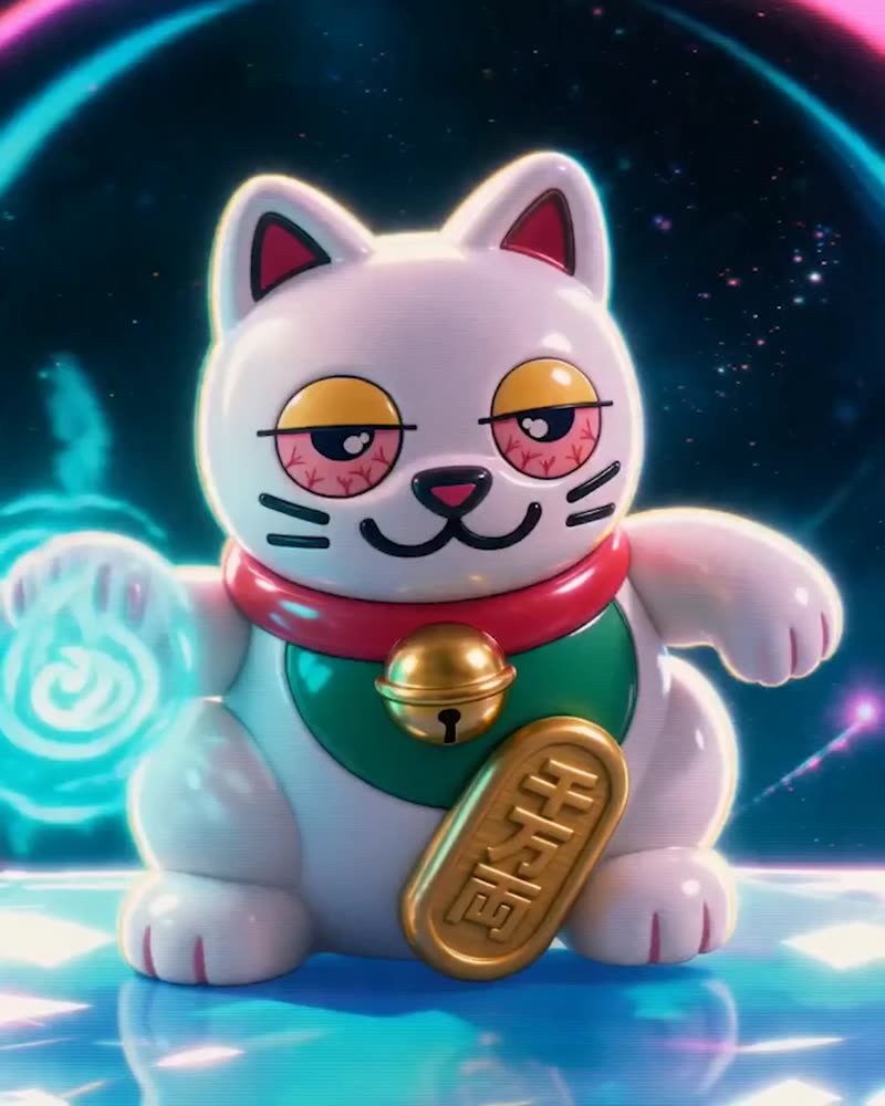
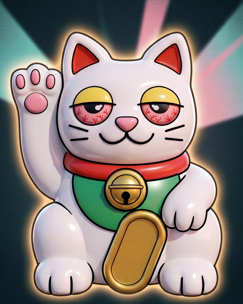
the final cat
finished hero render on navy. the version that ships on covers, cards, and the account itself.
one world, documented.
character brands fail when the mascot is a drawing instead of a system. NI-HIGH was built system first: the cat was sculpted in clay renders before color existed, the wordmark was drawn in two scripts as one piece, and every animation was boarded before render time was spent.
the result is a world that scales. twelve marks from sticker to poster, five animations from a three second sting to the full brand film, all recognisably the same character.
twelve marks. five animations.
one world.
badge, wordmarks, sticker sheet, title cards. from favicon size to poster size, one character throughout.
brand film, ad cut, burst sting, title sting, marketing loop. boarded first, rendered once.
Latin and Japanese drawn as a single system, not a translation pasted under a logo.
sculpted bare before color. the silhouette works at every size because it had to work with nothing.
want a system
like this?
i build content systems that keep working after you leave the room. start with the audit and you will know exactly what to fix first.
book fifteen minutes → start with the audit →